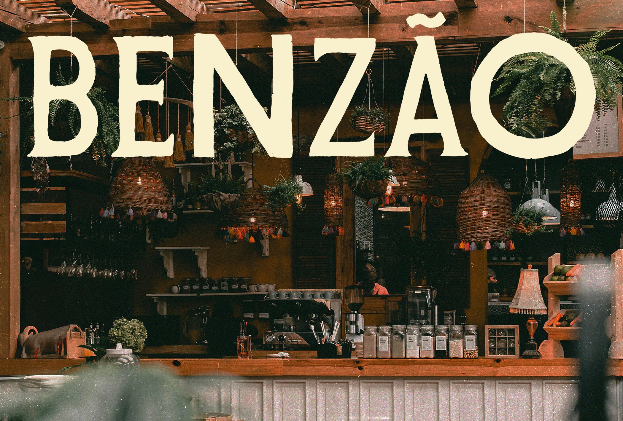
Benzão Cafe
Visual Identity Design for a Brazilian Cafe Brand
The Client
Benzão is a cosy Cafe specialising in South American and Brazilian coffee, along with all the rustic, beachy vibes inherent in these cultures. As with most independent coffee outlets, they aimed to expand into selling their own limited edition coffee beans and all the gear for home brewing. My goal was to design an identity that was not only relevant and fitting to their brand ethos but also as exciting and vibrant as the culture of their origins.
Design Vision
The design vision centred around this laidback, vibrancy of South America and Brazil. When designing identities for specialised national cuisines, I tend to focus in on the design iconography of the regions in question, which will naturally entice a sophisticated audience excited by travel, food and culture. With the perception of the best authentic coffee originating from the more exotic, far-flung regions (from a British perspective) of South America, Africa and Asia, the aesthetic of exotic trees and climates, patterns and rich colour palettes would be instrumental in guiding our audience towards this brand.
Creative Decision Making
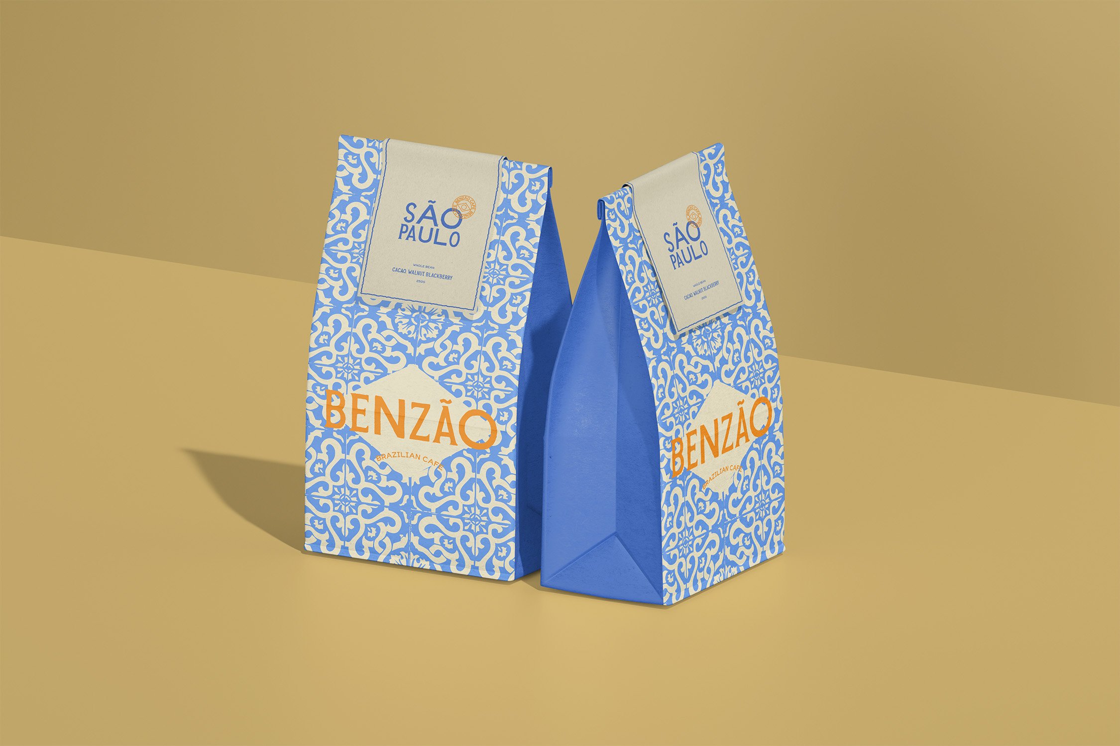
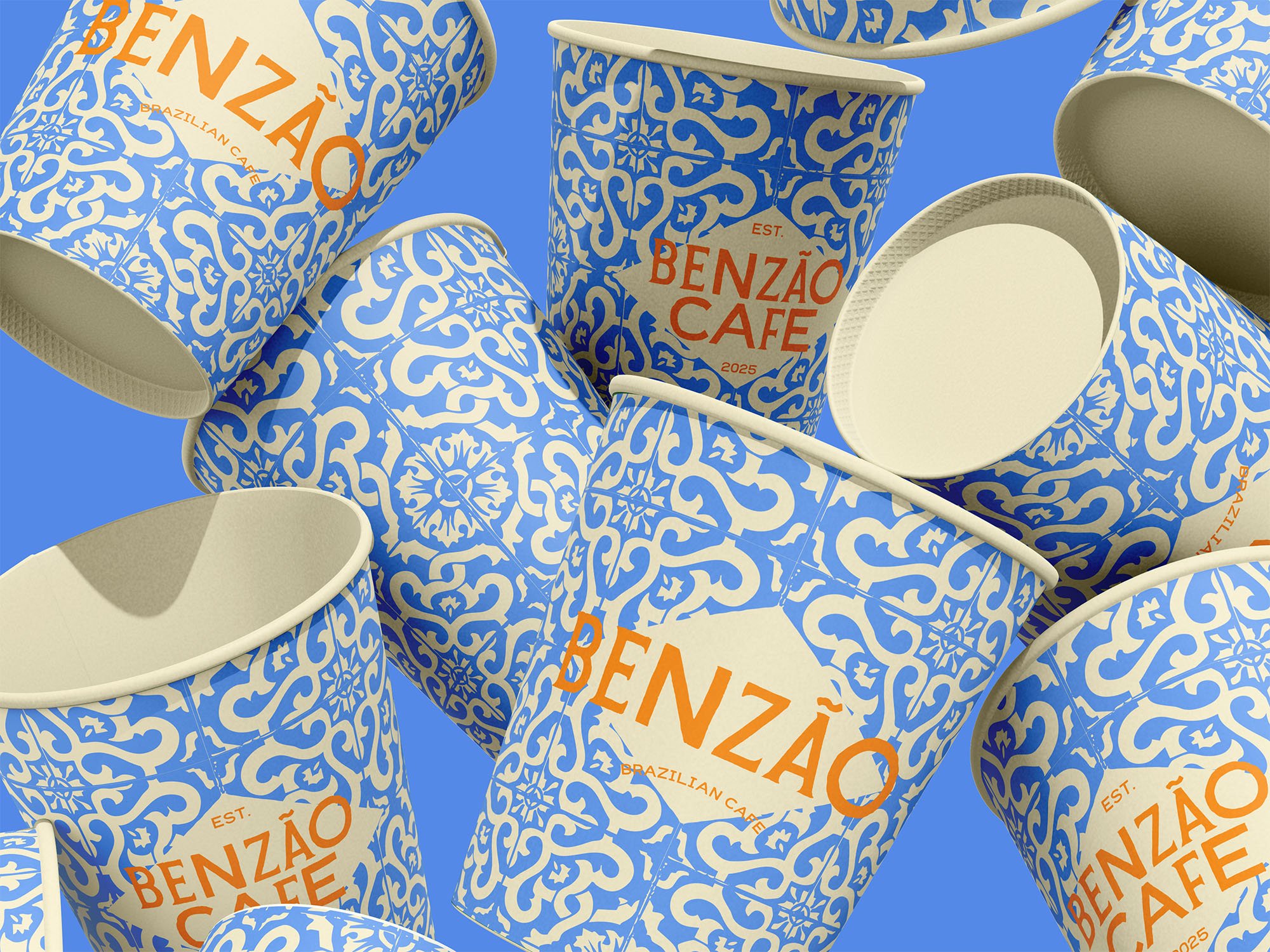
Pattern Design: The detailed Azulejo tile pattern is at the heart of this brand’s identity and is inspired by the rich tile culture in Brazil. Whilst these tiles did not technically originate in Brazil, they are an art form that has been passed among and celebrated by a lot of cultures and are now endemic to many of these cultures’ identities. Alongside the other brand elements, we were able to firmly label these as Brazilian tiles and not just any old Azulejos.
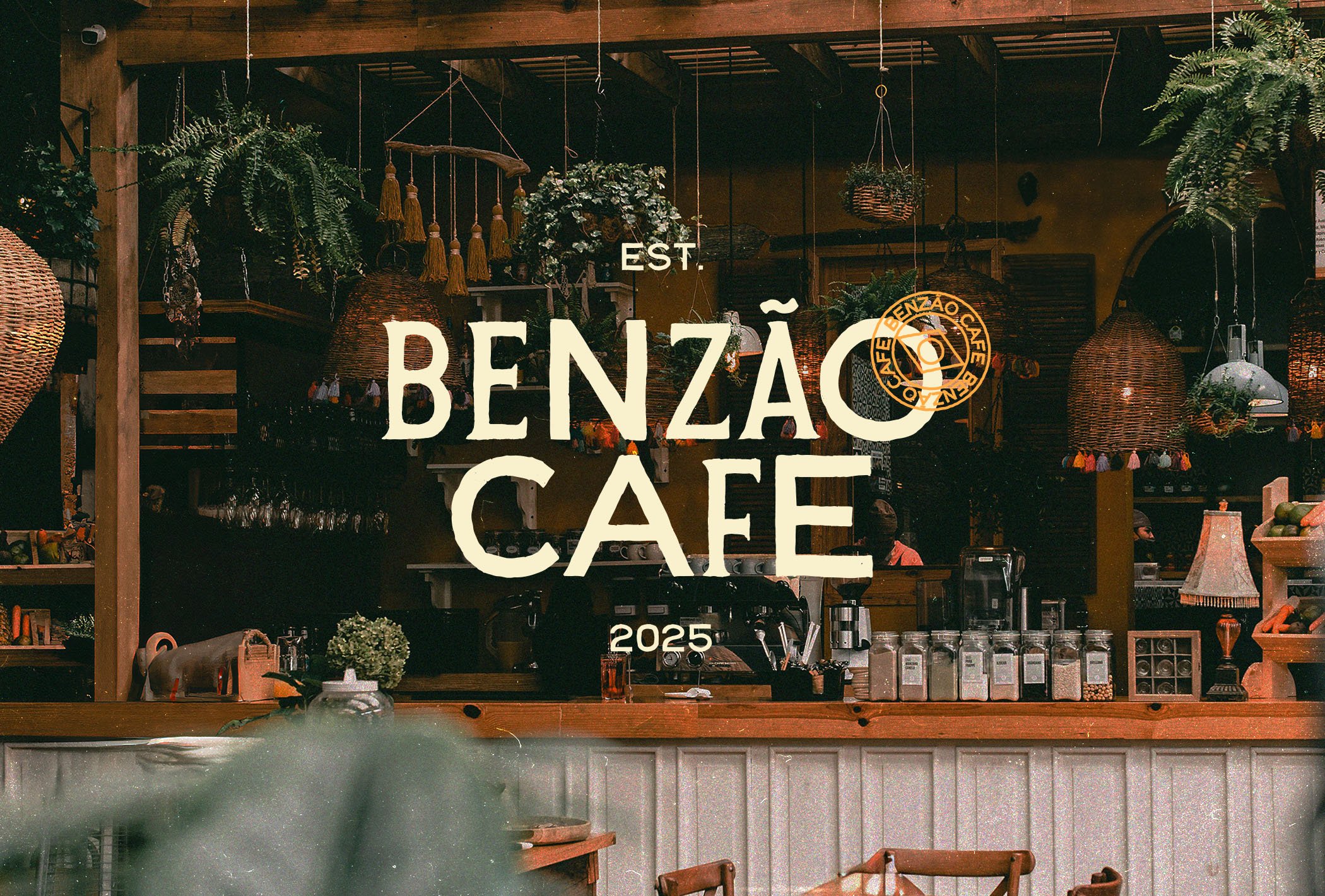
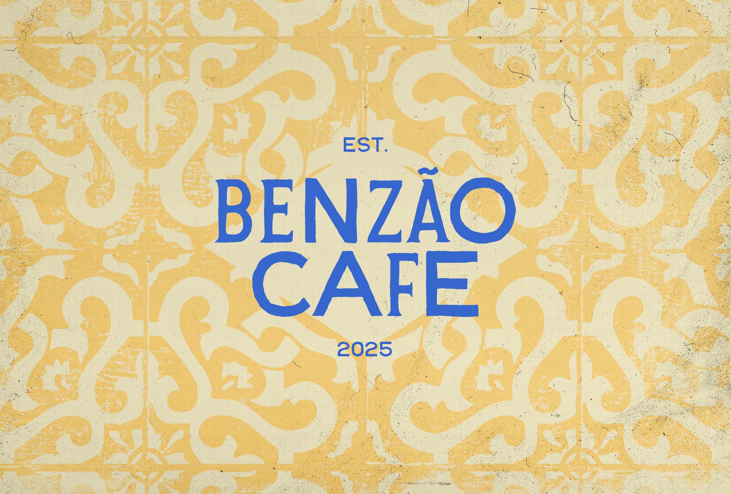
Typography: The typography is inspired by vintage signage printing techniques with mismatched lettering to give a considerable dose of Latin rusticity. South American design and typography is often in this way a bit rustic and laid-back in presentation, which is what I wanted to play on in order to give a burst of personality here. This design choice gives the identity a hint of South American character and tone of voice.
Colour Palette: With the brand’s art style focusing on these iconic tiles, the decision of what colours to use was mostly decided. The blue and off-white were used to make this parallel more prevalent, whilst various yellows are also often used in the painted patterns. I decided to make these base three shades slightly muted and creamy to provide a strong contrast with our accenting, vibrant orange. This helped with legibility when layering the logos over the patterns.
Logo Designs: The logos mostly follow a typographic design, making the most of our funky lettering, and the accent is always a welcome addition. With the addition of a minimal stamp icon, featuring the diamond of the Brazilian flag, we then have the ability to layer and stamp our compositions for more rusticity and handmade, artisanal vibes.
Implementation
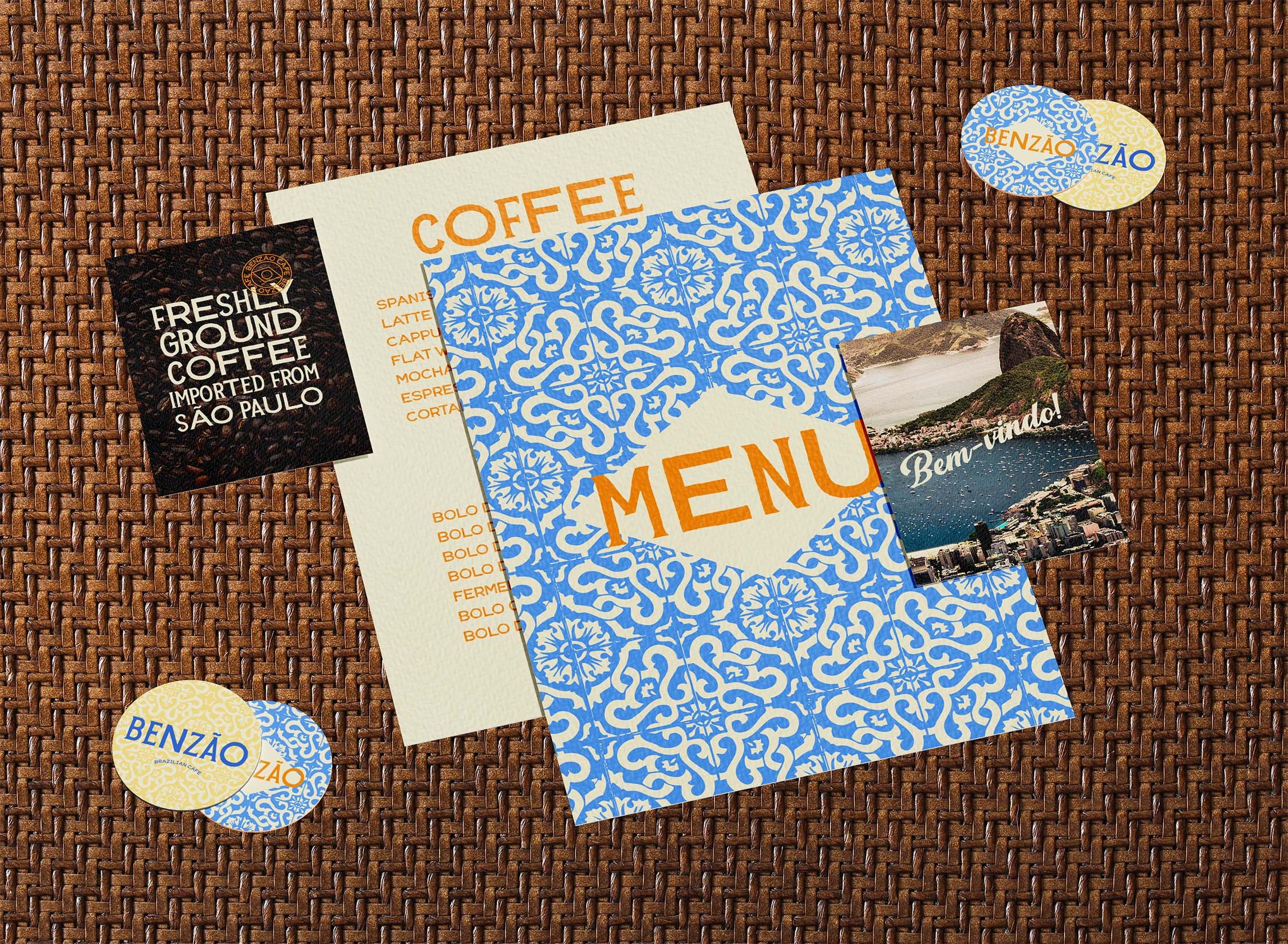
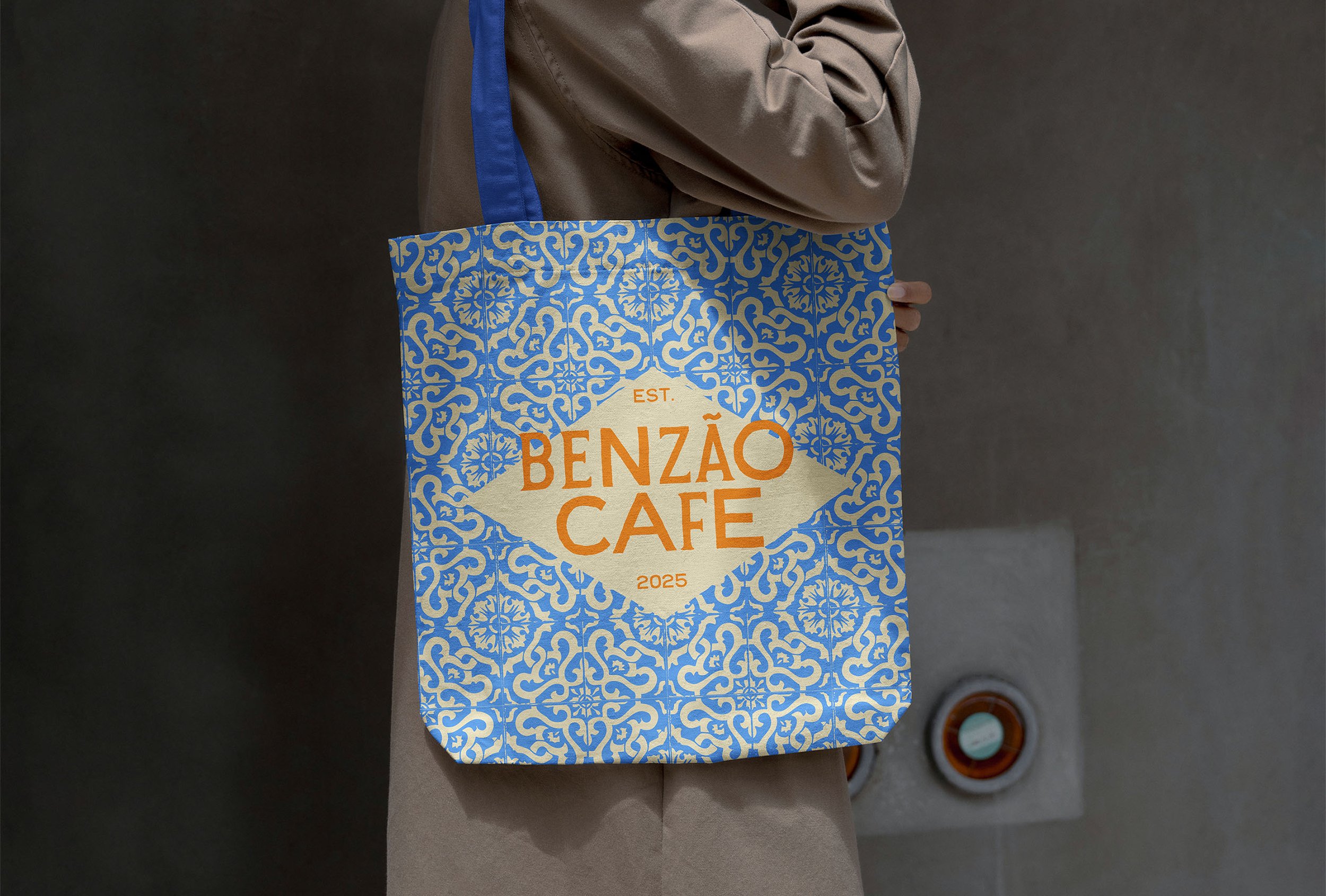
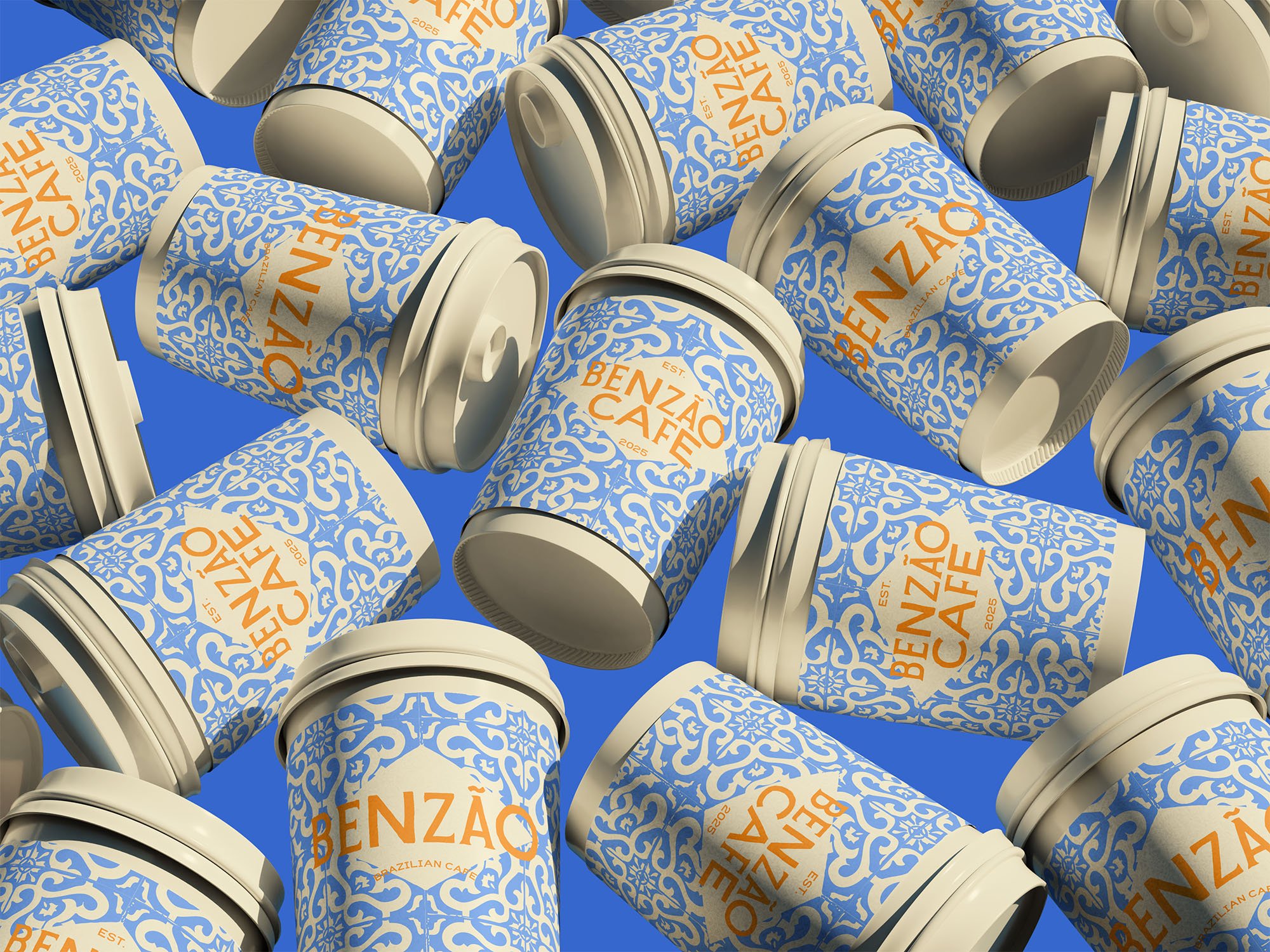
The patterns do a lot of the heavy lifting when implementing the identity onto packaging and branded collateral. The pattern is exciting and flamboyant, and immediately catches the eye, so it is a no-brainer to lay down on any new piece of collateral. The diamond of the Brazilian flag then acts perfectly as a tool to create some space for titling with copy in the contrasting orange colour sitting on top. Often, even when an identity is fully designed, there is some guesswork needed by the client to run the brand independently (should they choose to save some funds). But here the logic is designed to be straightforward and simple, even though the end result is far from it.
Results
The personality of the business sits in tricky waters, when the core building blocks are Latin rusticity, heavy patterning and vibrant colours a lot of businesses may come out with a messy, awkward and therefore cheap-looking identity. Here however, the intentional rough and rugged aesthetic comes in a sophisticated and polished package to show its audience it is both full of character and a premium cafe deserving of respect and admiration.
Conclusion
Maximalism doesn’t always have to mean the death of simplicity. Although this identity is built upon a very detailed and intricate pattern, when balanced delicately and used with the right colour compositions, you can still create a sophisticated and refined look built on minimalism and simplicity. Whilst the art style goes the whole hog and shouts from the rooftops, the colours and typography sit back, neat and tidy, grounding the overall effect and letting the designs breathe. Through this process, I was able to achieve an extravagant, exotic character packed with rusticity and charisma that can also be considered cool and understated. It grabs attention with cultural flair and then refines the experience with more understated and conventional elements.
