Miyako Green Tea
Visual Identity Design for a Japanese Green Tea Brand
The Client
Miyako provide authentic, Japanese green tea at their cafes, to brew at home and cold brew variants in supermarkets. The culture and ritual behind this peaceful beverage meant that the character should inherently be calm, peaceful and well-balanced, whilst the business intended to inject a bit of cool modernity and sophistication for the modern market.

Design Vision
The initial design vision centred around a simple minimalism that would speak with a calm yet bold tone of voice. Quietly sophisticated typography, simple geometry and symmetry were the initial ideas springing to mind when envisioning a personality for this restorative, enlightening beverage brand.
Creative Decision Making
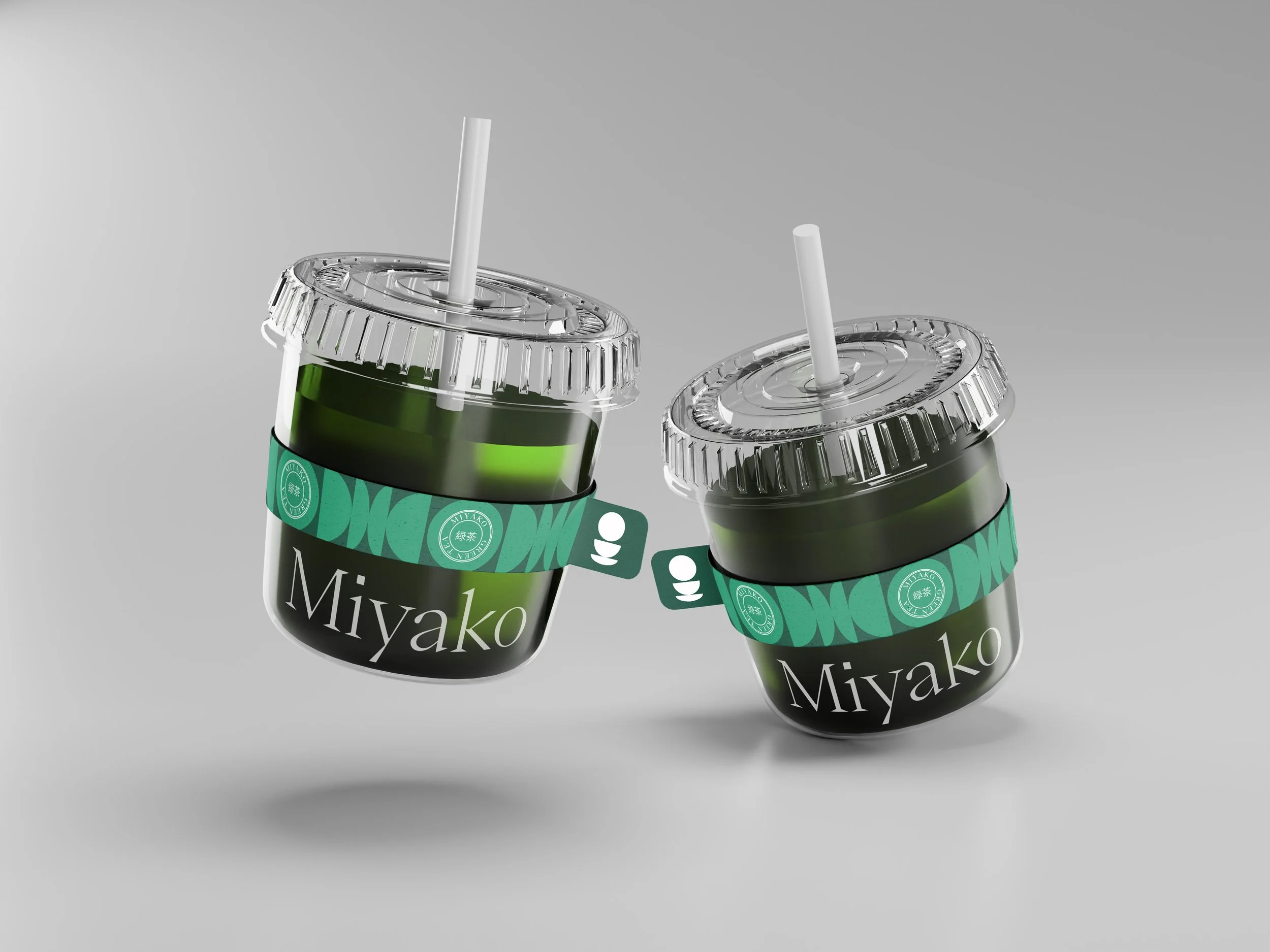
Logo Design: The logo was to have no gimmicks, no unnecessary visual clutter or ornamentation. I chose therefore, to focus on the font choice, something stylish, sophisticated and luxurious with an oriental edge that still remains grounded and authoritative. I wanted the word and letterforms to have space to breathe and give them some visual gravity.
Icon Design: The best way to accompany my minimal typographic wordmark logo was to introduce a minimal icon. The design vision here focused on the humble cup of tea. Using simple, basic geometry, I was able to create a minimalist representation of a teacup and saucer with a more abstract aura of balance and peace rising above.
Pattern Designs: The icon was designed with the intention of creating a pattern by repeating these basic geometric shapes. The intention was to add a slight contrast and interest to the backgrounds of the artwork so that our dainty, light logo could still be legible when layered on top.
Colour Palette: The colour palette is built up of various shades of green that show a modern vibrance whilst remaining grounded and rooted within our signature drink. These colours show the natural, replenishing qualities of the beverage brand and allow for a subtle enough contrast with the patterning techniques.

Implementation
When implementing the identity to print and digital assets, a simple, easy-to-replicate logic arises. The patterns will adorn the backgrounds while simple typography sits on top. Talking plainly and calmly to the audience. This simple structure allows for sustainable reproduction for my clients should they need to run the business independently, without the support of a Graphic Designer.
Results
This patterning immediately grasps the audience’s attention with a refined and elegant look, which is amplified by the sophisticated fonts and typography used. With this beverage’s identity design, we were able to achieve a unique, eye-catching experience whilst preserving a touch of class and balance necessary for marketing this product to its target audience. Like the drink itself, the identity design balances many qualities in order to make a reliable, comforting structure that will both excite and nurture its loyal customers.

Conclusion
In the current market, where often whoever speaks loudest wins, building a calmer, quieter personality can be challenging. Utilising some of the effective elements in modern marketing alongside some tactically chosen hints of sophistication and luxury whoever we were able to achieve a well-rounded, attractive experience that rewards lovers of peace and tranquillity with respect and comfort. Not only does this brand stand out on shelves and high streets, it empathises with its audience and calmly offers them a port in the storm of intensity elsewhere.
