Alchemy Brews – Craft Beer
Crafting Visual Identity for an Independent Craft Beer Brewery
The Client
Alchemy Brews is an exciting craft beer start-up that draws it’s inspiration from the medieval, reviving the ancient chemical origins of beer and ale with a contemporary twist. The founders envisioned a brand that stands out in the crowded craft beer market, avoiding the pitfalls of generic and overdone design, catering to a mature target audience seeking sophistication and a touch of eccentricity in their beverage choices.

Challenges in designing a modern Beer Visual Identity Design
Navigating the intricate balance between a visually compelling identity and the potential risk of appearing as a novelty drink was a crucial consideration. As the craft beer market becomes increasingly saturated, the challenge was to create a brand that not only captures attention but is also instantly recognisable as a distinctive player in the industry. The established brands in the industry balance a narrative of relatability with sophistication to promote a message of authority whilst also appearing using comforting and approachable. To do this they use references to history, heritage and class in their intricate typography, vintage imagery and masculine colour palettes.
Design Vision
Based on my target audience research and competitor analysis I thought it made most sense to double down on this narrative of medieval/ fantasy heritage, connoting medieval taverns and castles as well as potions and monsters. This genre in fiction and television is a favourite among the target audience and the topic is rich with texture and imagery that we could use to our advantage of designing a strong, luscious identity for this brand.


Creative Decision Making
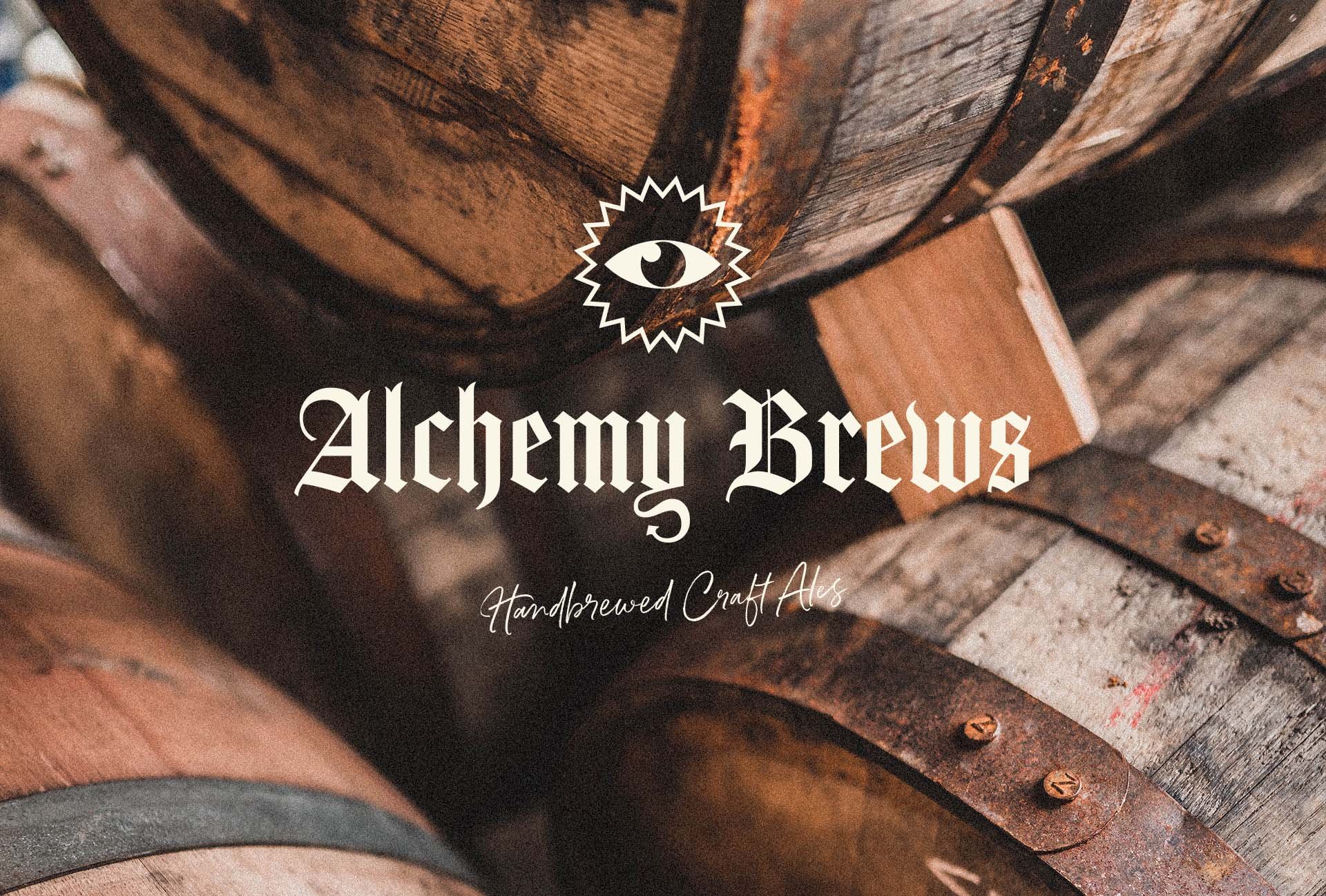
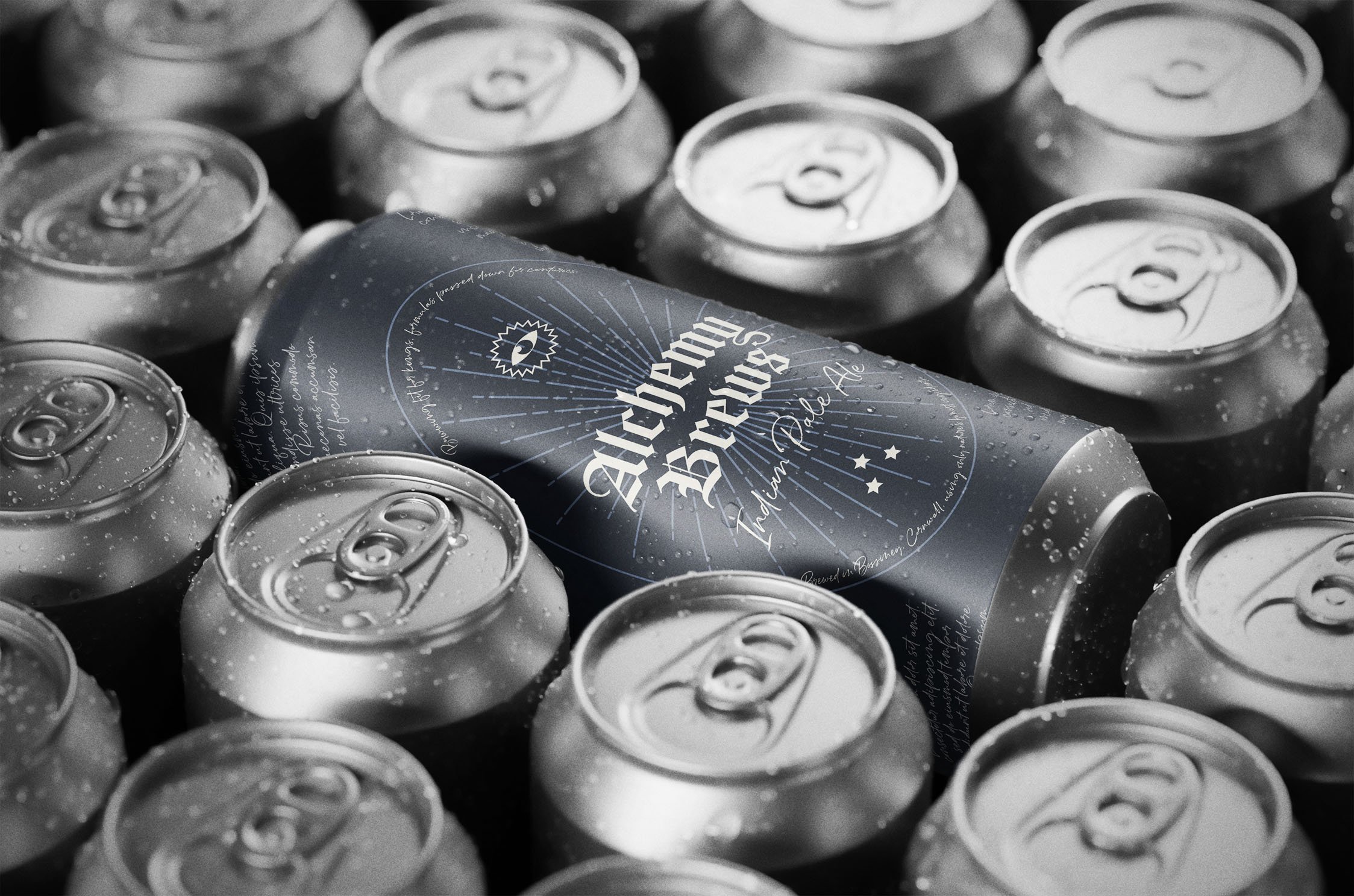
Typography – A common trope amongst beer branding as well as the medieval is blackletter, gothic fonts. This option is visually appealing and having a current resurgence within modern, edgy design trends. This therefore gave us a three-for-one win of positioning this brand as a beer company using a recognisable trope of the industry, setting the tone for our medieval/ fantasy narrative as well as appealing to a modern and edgy aesthetic. This hero font was used for the logo and paired with a rustic hand-written font to symbolise fantasy fiction, spell books and old scrolls.
Logo Designs – These font choices did a lot of the talking when it came to designing the character of the primary logo. The Y letterform also provided an opportunity to introduce a touch of fantasy mischief, adding a forked tail to encourage imaginations such as dragons, devils, or goblins and adding an intentional layer of mystery to the brand. A minimally designed, all-seeing eye icon was also created as a simple identifier for the brand, resonant with ancient alchemy imagery and serving as a versatile element in the artwork, doubling as a badge or stamp when needed.
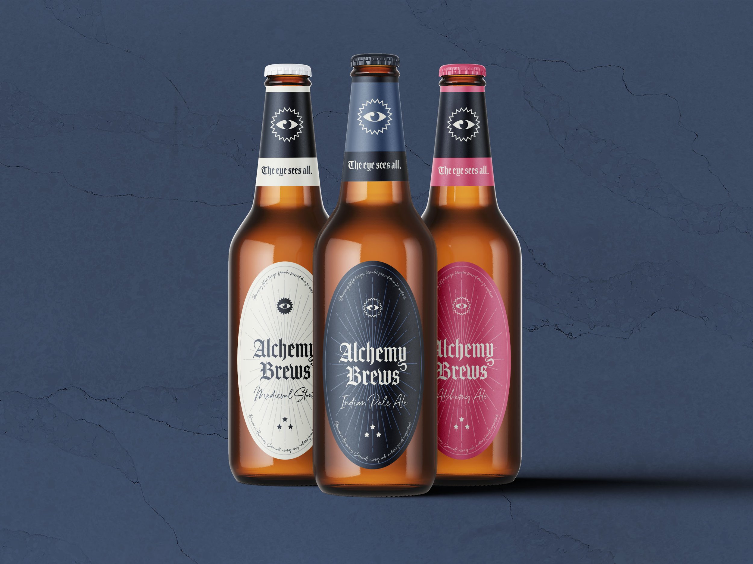
Colour Palette – A carefully chosen stoney off-black and off-white parchment colour palette was chosen as a double in symbolism with the iconic colour of stout and its creamy foam head. To accent these primary colours a potion pink is used to give the brand a splash of difference and bring a bit of magic to our fantasy narrative. This choice disrupts conventional norms and injects vibrancy, creating a lively and unique visual appeal.
Implementation
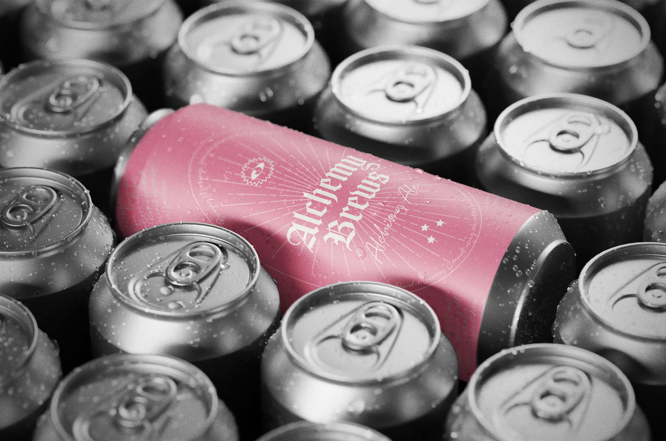
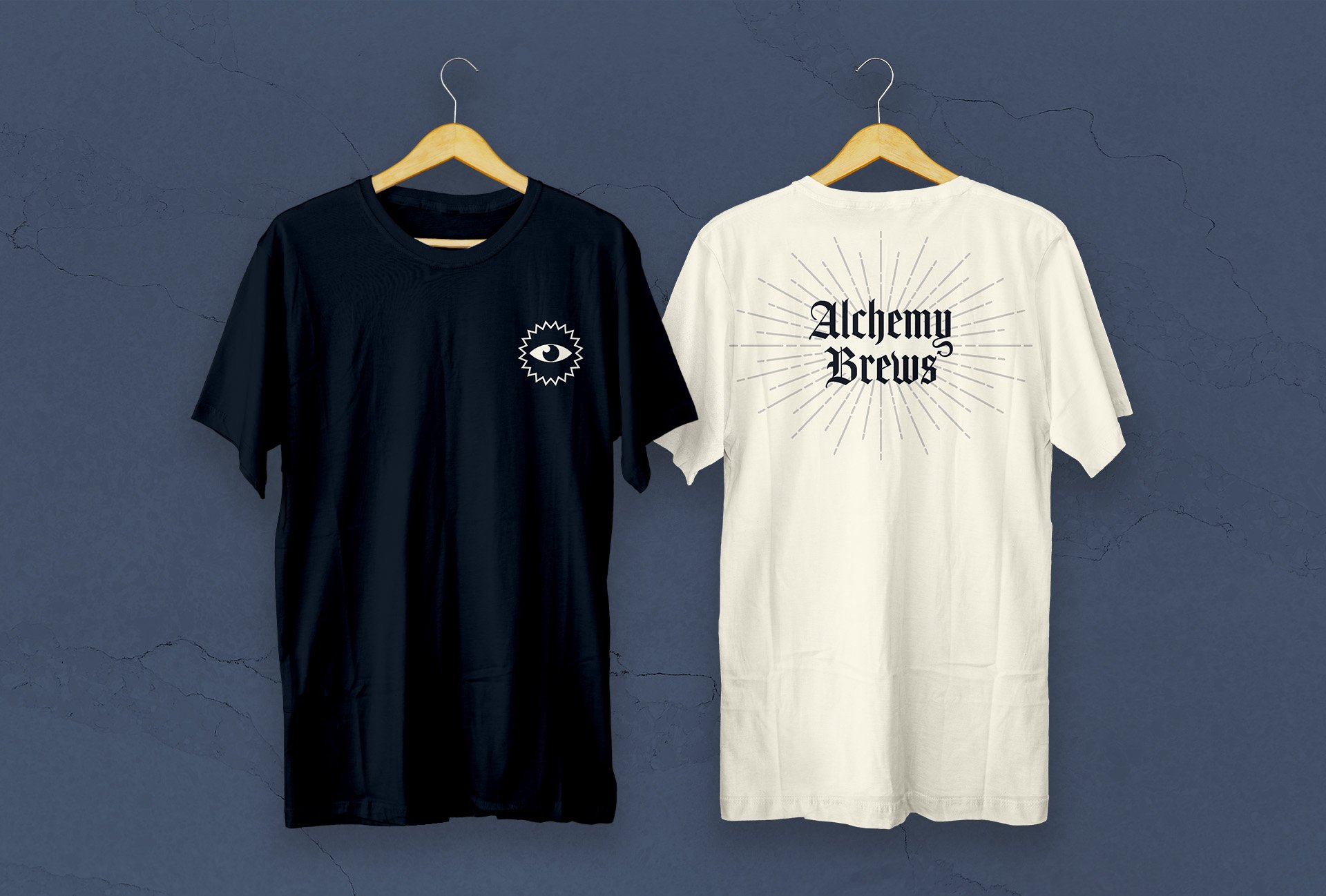
The visual identity graced beer bottles, cans and print assets with our hero gothic font taking centre stage and the vintage script font for further detailing, reminiscent of handwritten scrolls from scholars and scientists of times gone by. A simple yet effective patterned illustration was designed to add texture and impact for the logo placements, shining light from it’s source and suggesting a magical higher power or divinity associated with the product.


Results
The visual elements seamlessly translated across branding and packaging, positioning Alchemy Brews as an independent craft beer with a visual identity that stands out on the shelves. The deliberate fusion of historical aesthetics with contemporary design not only captured the essence of wizardry, magic, and history but also differentiated the brand in the competitive craft beer landscape.
Conclusion
Through strategic and informed visual identity design, Alchemy Brews has successfully carved its niche in the independent craft beer scene. The design choices shaped a brand that is not only visually appealing but also instantly recognisable in a market inundated with diverse offerings. Alchemy Brews stands as a testament to making brave choices in design in order to establish a distinct and memorable presence in the competitive world of craft beer.

