Gelatopia
Brand identity design for a Gelato Shop
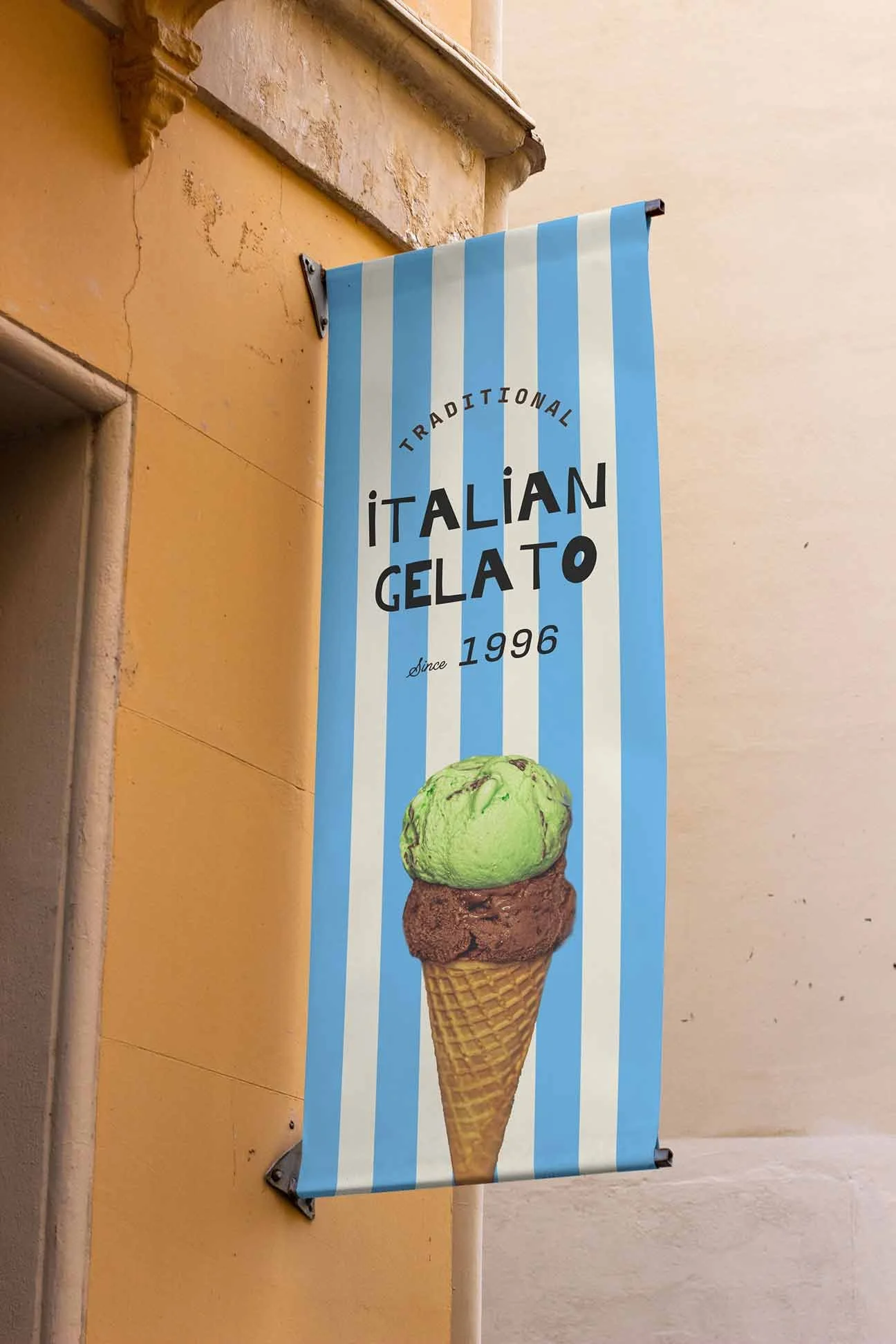
Gelatopia is a gelato shop with a firm understanding of its heritage and what makes it unique. The history of gelato is one that evokes feelings of Italian summers, diving into blue waters and ice-cold refreshment. The food itself is a range of pastel colours with a glacial sheen and is often adorned with dark chocolate chips. The brand, therefore, had to embody these stories along with a nod to the foodstuff’s history and aesthetics. To stand out on a busy high street as well as amongst other ice cream and gelato sellers.


The title font was chosen with a primary audience of children in mind but with a rustic vintage Italian feel to it too as if it were hand-painted in the 60s. This history is accentuated by the supplementary typography, using selling points and extra details about to business to sell as you would have seen in marketing posters and logos of the period. The classic striped colours act to further establish this time period whilst using pastel shades of blue and pink amongst a vanilla-esque off-white. This more laidback and sophisticated use of colour and texture in the field of desserts establishes the brand as a more adult-centric brand and sets itself apart from the over-saturation and energy of other ice cream businesses aiming their products primarily at children.

These choices culminate in a considered and handcrafted care similar to the business’ loving process of creating Gelato. The brand is designed to stand out from the over-saturated colours and illustrations of other confectionary businesses which will set up their stalls down the high street. Instead opting for simplicity and class to set it apart and welcome an older audience to partake as well.