Spicy Burro - Logo and Brand Identity Design
Brand Identity Design | Logo Design | Packaging | Print Design
Spicy Burro is a Burrito company that began life as a street food truck and aimed to move its products into supermarkets with its unique takes on the Mexican classic. The name means translates to Spicy Donkey and this playfulness carries across to their products and their brand’s ethos. The company merges flavours from across the world with whacky but delicious combinations that you probably haven’t tried before. The challenge, therefore, was to match this energy and create a rebrand that packed as much of a punch as the burritos they sell. The name means translates to Spicy Donkey and this playfulness carries across to their products and their brand’s ethos.
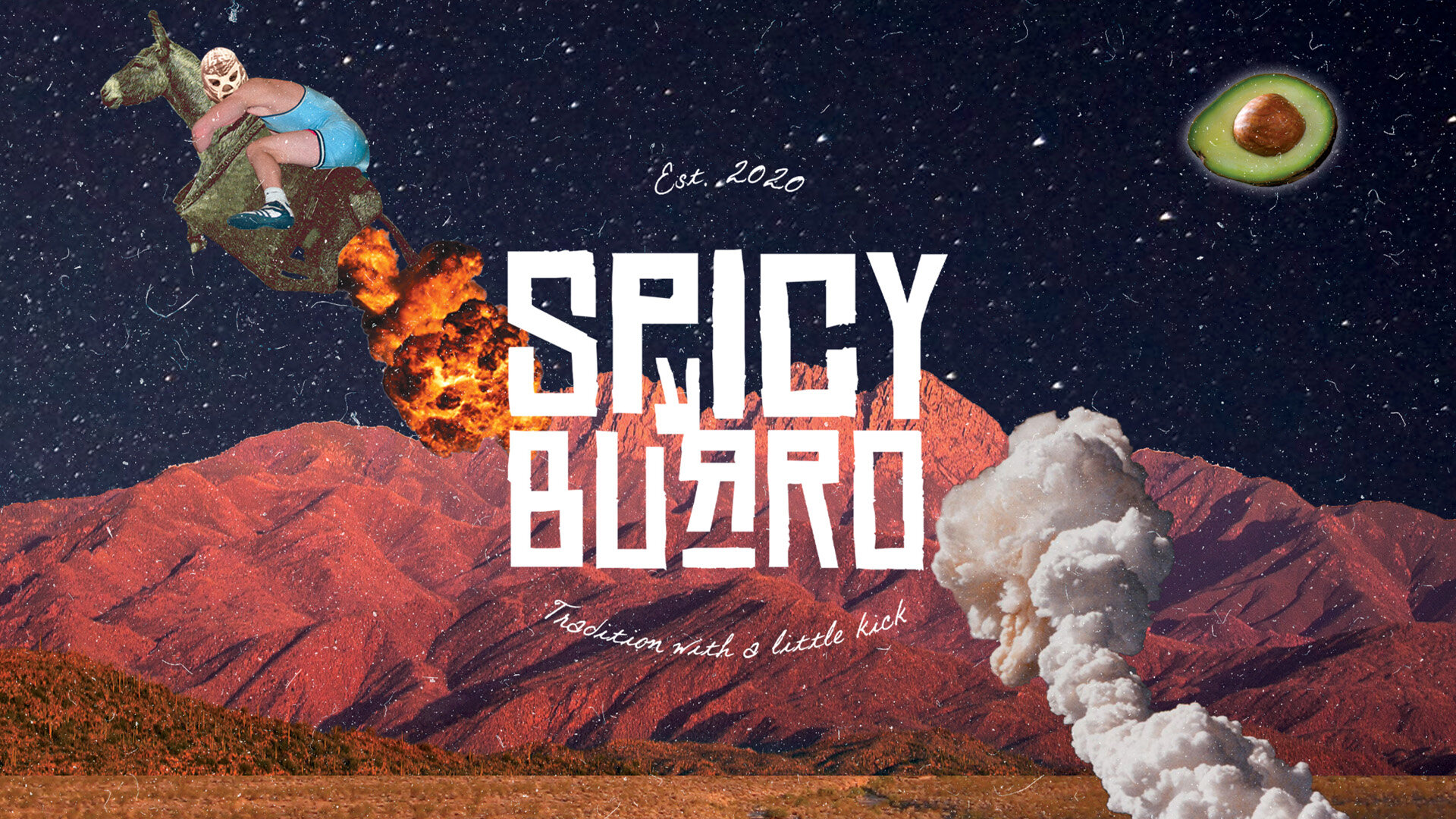

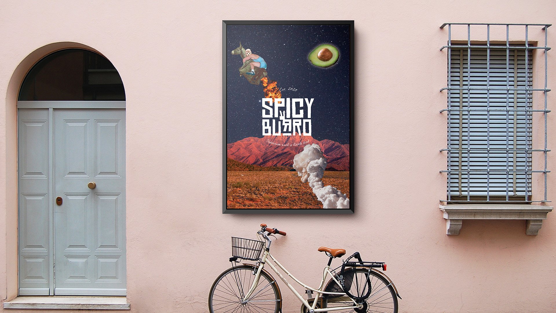
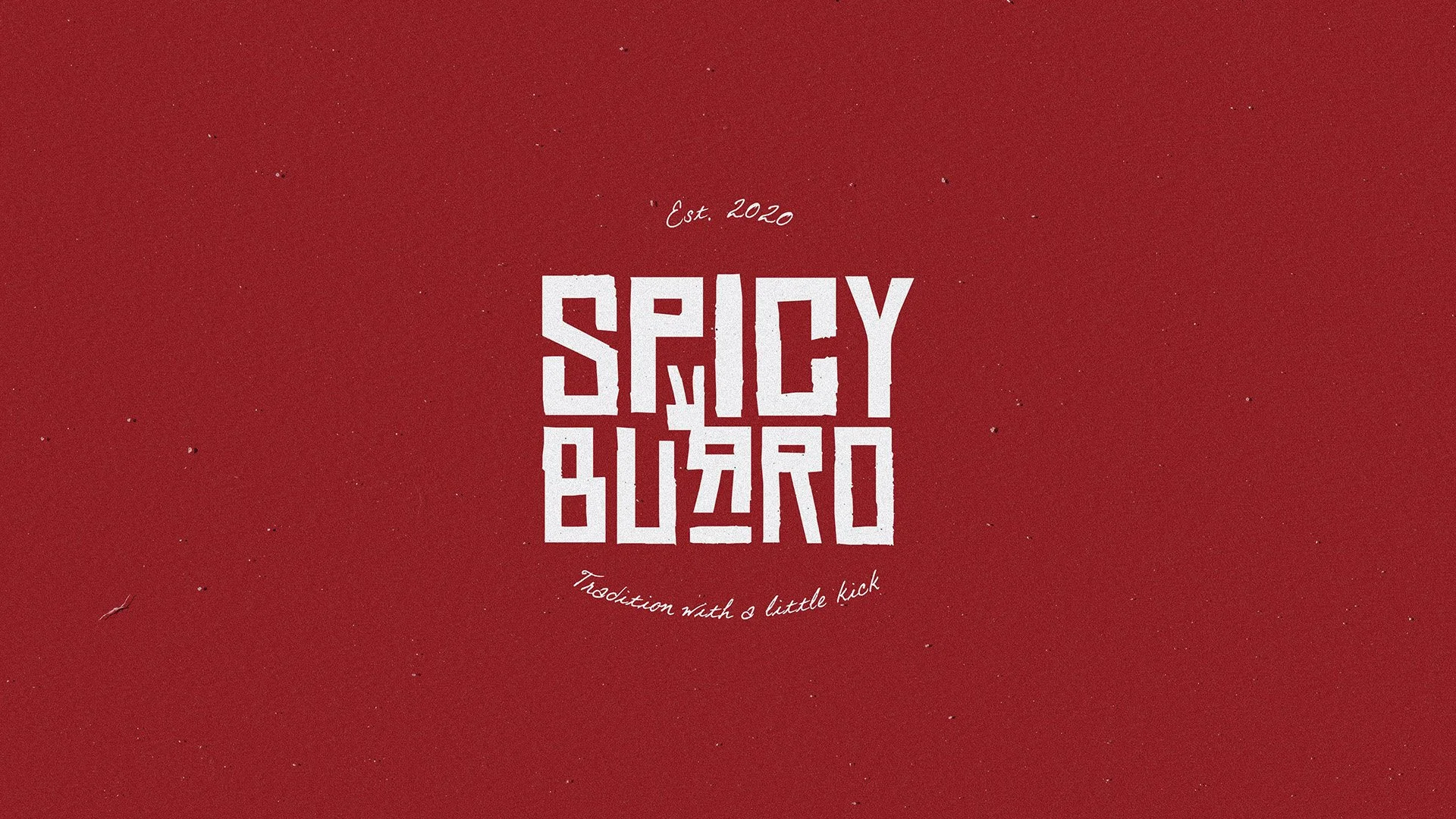

The logo mark was created using a playful western font tying the brand to its origins in Mexico and simply warping the letterforms to create a donkey icon within the logo mark. The artwork made to accompany the flavour mashups features mashups of imagery associated with the flavours and cuisines involved to create bright and bold surrealist pieces that match the company’s personality.
Spicy Burro came away with a powerful, energetic brand identity design to place them in a unique selling point in the world of supermarket ready meals. With playfulness paired with a simple idea, an iconic logo was created to front the business and match its energy. The logo is bold and strong enough to hold its own when applied on top of the detailed and boisterous artwork, tying it together succinctly and centring the madness.
