Yum Bun Mexican Restaurant
Brand Identity Design for a Mexican Street Food Restaurant
The Client
Yum Bun is a vibrant and energetic Mexican restaurant needing an impactful visual identity design to convey its uniques flavour and zest. Mexican cuisine is inherently spicy, zingy, colourful and lively which are all powerful inspirations for where a brand like this should head with a sprinkling of the cultural aspects, wildlife and iconography of the region this was an exciting journey to embark on. Caution had to be advised though, with some overused and unrepresentative imagery of Mexican culture giving easy shortcuts to designers working in this niche in the current climate being something we want to avoid in order to build a genuine and unique identity for this brand.


Design Vision
The vision here was to create a modern interpretation of Mexico’s personality, using a vivid colour palette taken directly from the vibrant foodstuffs of some of the regions most iconic dishes. I wanted a relatable, human experience which is a little rough around the edges, laidback in it’s aesthetic and full of life.
Creative Decision Making
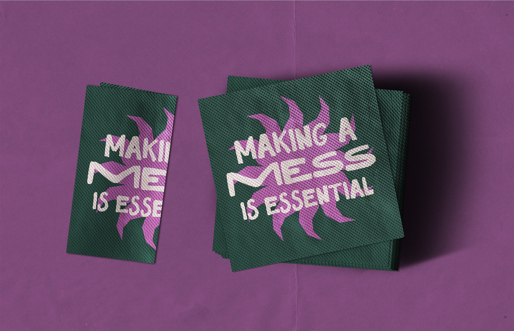
Logo Design – For the logo I wanted to show an immediate western character by choosing a few Mexican inspired typefaces and carefully choosing letterforms from each that best gave the character and aesthetic I wanted. I then edited some of the letterforms to make them more succinct as a logo and gave us a unique one-of-a-kind typeface for our identity design. I created an accompanying mascot icon from an Aztec sun pattern which gave our brand some extra character which could be doubled as a stamp on our design assets.
Colour Palette – The vibrant colour palette is taken directly from some of the foodstuffs of Mexico’s most iconic dishes and the deep green colour connotes the beautiful shade used in Mexico’s national flag. This allowed us to literally garnish our designs with bright lime accents and top with complementary shades of pickled red onion.
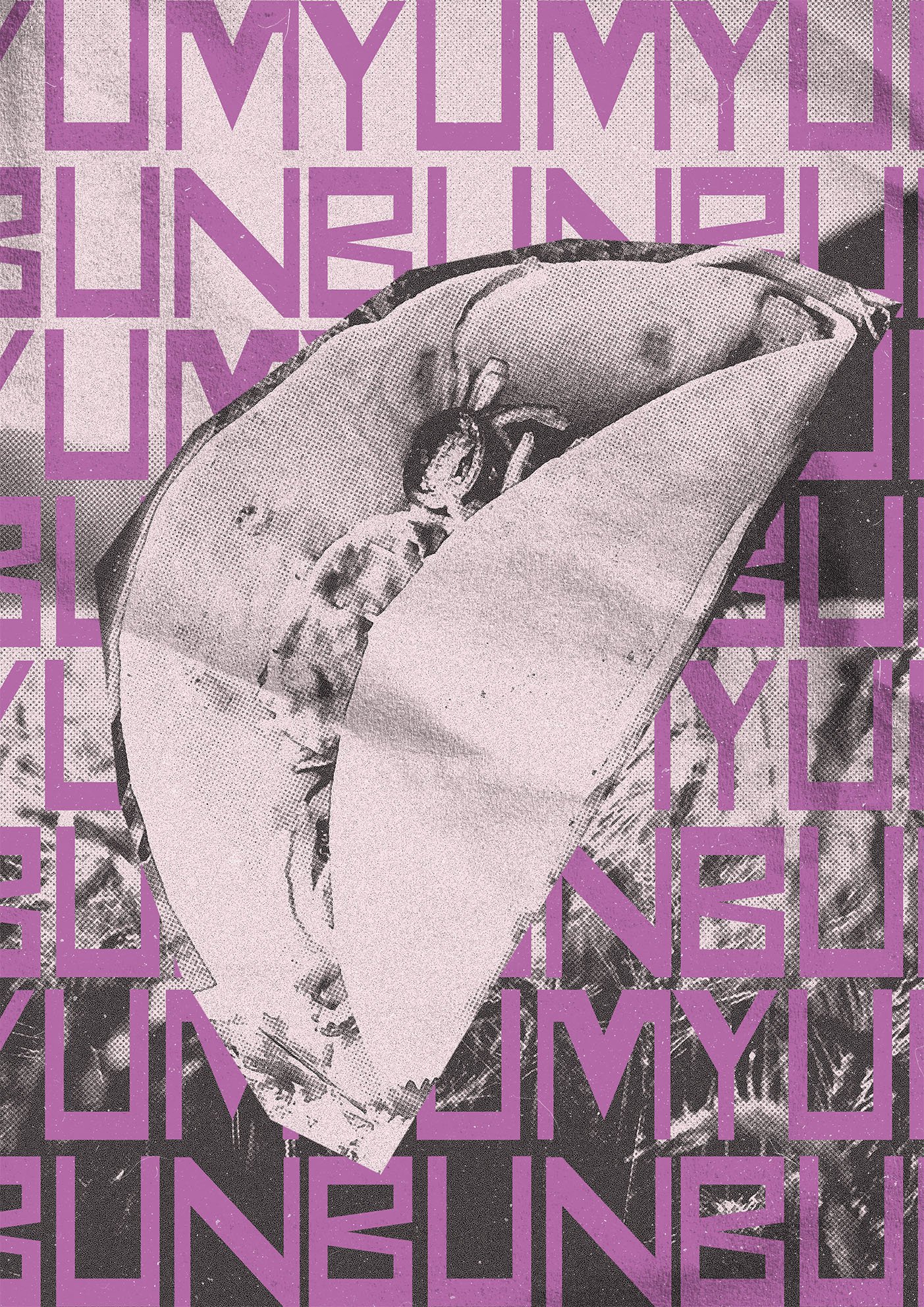
Art Style – The art style is derived from vintage and lo-fi western films, using halftone patterns and desaturated images along with rough textures and colour overlays to give us a whacky vintage, spaghetti western collage. This allows us to use imagery of the food, ingredients and other relevant imagery in a unique and iconic composition.


Implementation
The strategic design of the brand assets made implementing this identity across print and digital extremely efficient. Images of the products and ingredients as well as accompanying Mexican iconography lead the way on marketing content in our halftone collage designs and the bright and bold colour palettes and fonts gave us a whacky and charismatic personality with ease using a relatively simplistic framework.
Results
The visual elements of the brand pulled together to create a powerhouse, energetic and lively visual identity which perfectly characterised the business’ ethos and matched their vibe perfectly. The artwork is eye-catching and unique and the identity gave the client the sophistication, credibility and confidence to run their restaurant and carve a niche for themselves in their locale.


Conclusion
This project was a testament to being yourself in branding and not being afraid to do something different. We avoided the cliches of Mexican cuisine, created a loud and disruptive visual identity and designed it strategically to make sure it was sustainable and easily replicated long-term in-house. Designing a simple but effective logic to your identity allows for huge savings in time and money long term and makes designing visually sophisticated assets comparatively easy.