Oooh Pho
Visual Identity Design for a Vietnamese Restaurant
The Client
Oooh Pho, a traditional Vietnamese restaurant, sought to redefine its visual identity to resonate with a modern Western audience while remaining true to its culinary roots. The company’s name goes a long way in terms of identifying the brand and it’s tone of voice already, leaving it up to me to match this energy with the visual communication.


Design Challenge
With asian cuisines being immensely popular in the United Kingdom and their personality and character speaking for itself, the challenge was to stand out from these vibrant and exciting competitors in our client’s vicinity. To make the most lasting and authentic impression the Vietnamese restaurant’s logo and visual brand identity needed to bridge tradition and modernity. The task as ever with a project like this is to appeal to a wide, youthful audience whilst preserving the culture and history of the source, creating an authentic narrative for the business to tell its customers.
Creative Decision Making
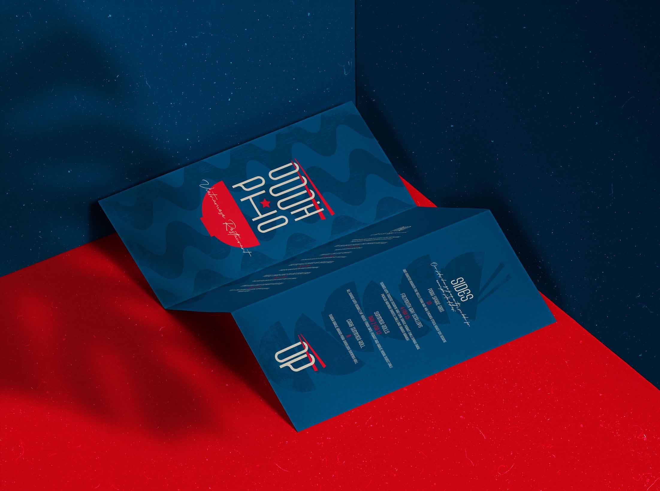
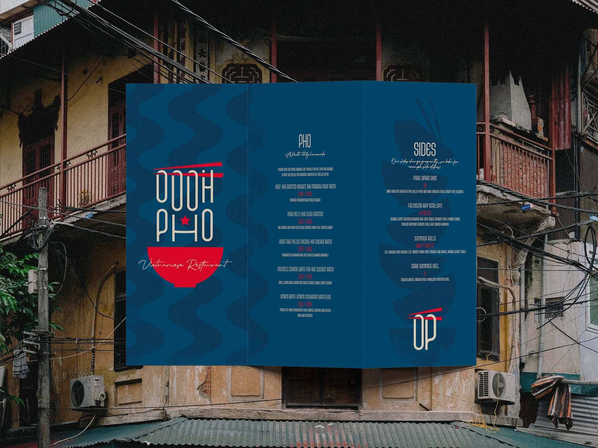
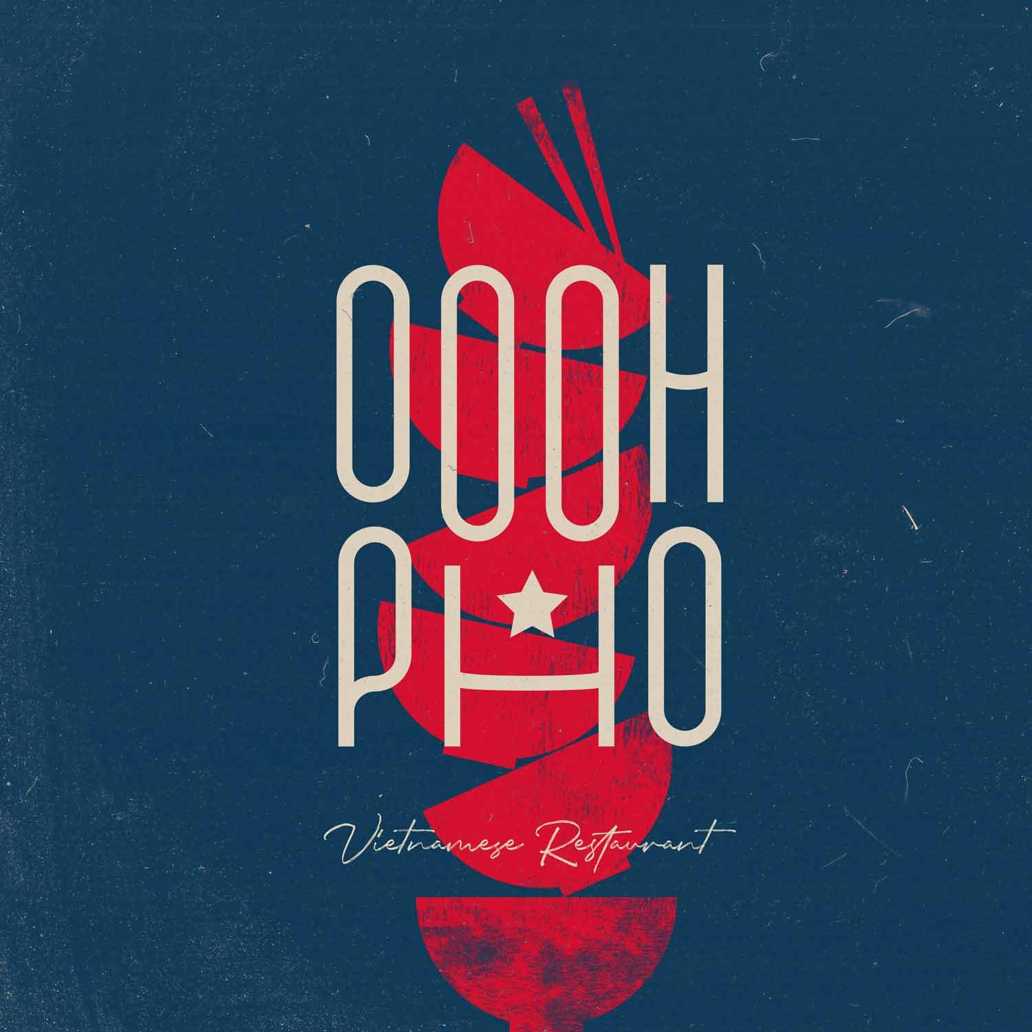
Logo Design: Embracing the abundance of "Os" in the title, an appropriate condensed font was strategically chosen to resemble ramen noodles — a signature feature of traditional Pho bowls. The use of these Os created a unique glyph for the logo, veering away from conventional English letterforms and giving us a unique character. This not only provided an oriental aesthetic but also avoided the need for a cheap, over-stylised font. The incorporation of a traditional Pho bowl and chopsticks brought balance and dynamism to the typography elements, encapsulating the iconic dish of Vietnamese cuisine.
Brand Pattern: The iconic waves of ramen noodles became the basis for a simple striped patterning, forming a distinctive and recognisable brand pattern. The logo design’s exploration paved the way for a very simple and effective solution here, in terms of creating memorability, these simple ideas are more often than not the best.
Typography: With the typography used to create the logo being custom made, the base font could simply be paired with it to create the contrast essential for a font system. A carefully chosen rustic, hand written font added a bit of extra contrast and character to the designs as well as a bit of fiery flair.
Artwork and Texture: Disturbed ink textures and subtle two-tone backgrounds were introduced to the brand artwork. This intentional choice embraced rusticity, character, and history over mainstream polish, creating a unique visual identity.

Implementation
The carefully crafted Vietnamese restaurant logo and brand identity were seamlessly implemented across various touch points. Printed assets and signage, infused with the distinctive logo and brand pattern, allowed Oooh Pho to stand out prominently in the competitive landscape of high street restaurants.
Results
The innovative design approach equipped Oooh Pho to make a lasting impression with its target audience. The logo's unique glyph, combined with the oriental aesthetic and traditional elements, conveyed a refreshing, laidback, and rustic ambiance. This approach set Oooh Pho apart from mainstream competitors, aligning it with the growing popularity of Vietnamese cuisine among modern Western audiences.

Conclusion
Oooh Pho's journey to redefine its visual identity proved triumphant as the Vietnamese restaurant seamlessly merged tradition with modernity. Faced with the challenge of standing out in the vibrant UK culinary scene, the designs avoided cliché and emphasised an authentic oriental aesthetic. The logo design stood out as more than first meets the eye and paired with the brand pattern, inspired by ramen waves, enhanced memorability tenfold. Custom typography and rustic textures further infused character, and implemented across touch points, from signage to printed assets, the carefully crafted visual identity has positioned Oooh Pho as a standout in the high street restaurant landscape. Resonating with a diverse audience and successfully marrying cultural authenticity with contemporary appeal, epitomising the success of strategic design innovation.