Crust & Crumb – Sandwich Shop Visual Identity
Designing an Identity for a Local Sandwich Specialist using the Charm of Bread
The Client
Crust & Crumb, a local sandwich shop, sought a visual identity that reflected its minimalist and peaceful energy. The goal was to create a brand that captures attention in a market saturated with new cafe businesses while exuding sophistication, style, and charm. The name itself, referencing the simplicity of bread, served as the inspiration for the design.
Challenges in Designing a Cosy Cafe Identity
In a world with abundant new cafe businesses, the challenge was to make Crust & Crumb a quaint and charismatic identity that appeals to the locals who may already be set in their ways about their go-to spots. Balancing simplicity, charm, with a vibrance that would demand the attention of passers was essential for success.
Design Vision
Sandwiches are built upon something that we all know and love, that is one of, if not the ultimate household name… Bread. Bread is the life and soul of sandwich shops, the feeder of the planet and the go-to for the hungry. I wanted to use this theme to design an identity that made us all remember how much we owe to bread and how warm its embrace is. What better mascot could there be for a Sandwich shop wanting to communicate comfort, homeliness and approachability?
Creative Decision Making
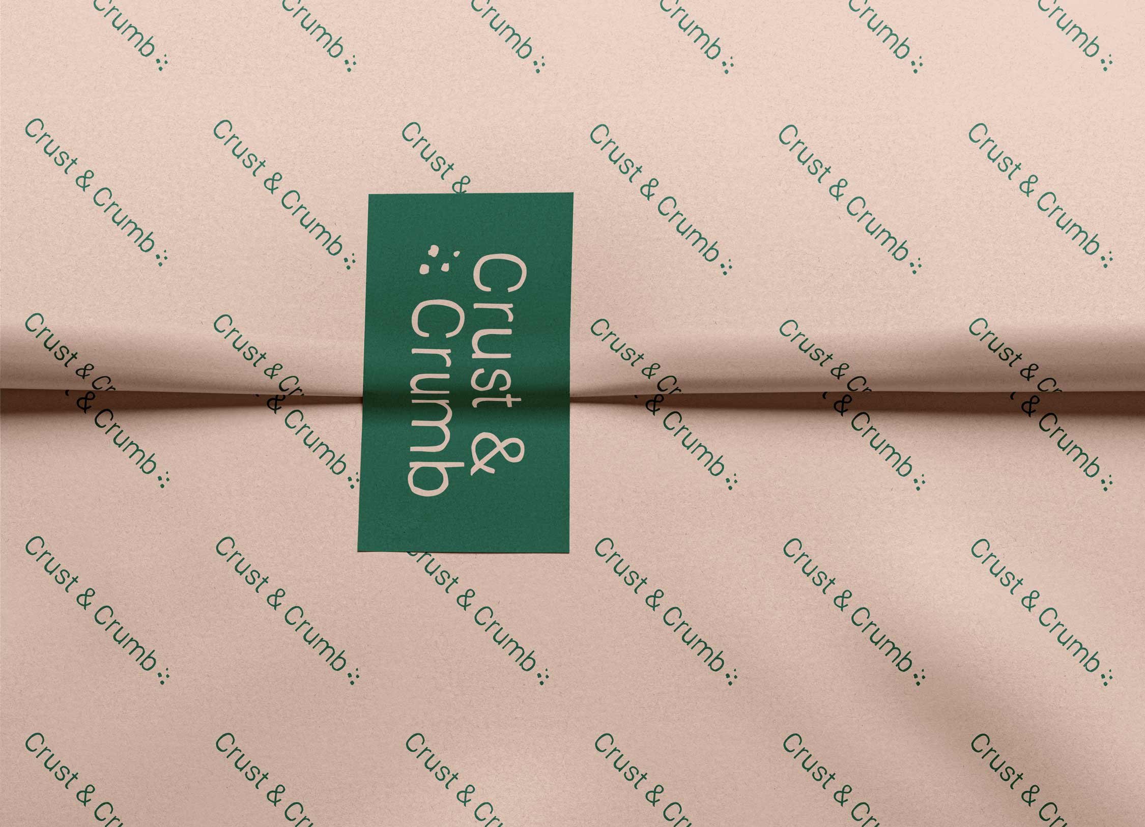
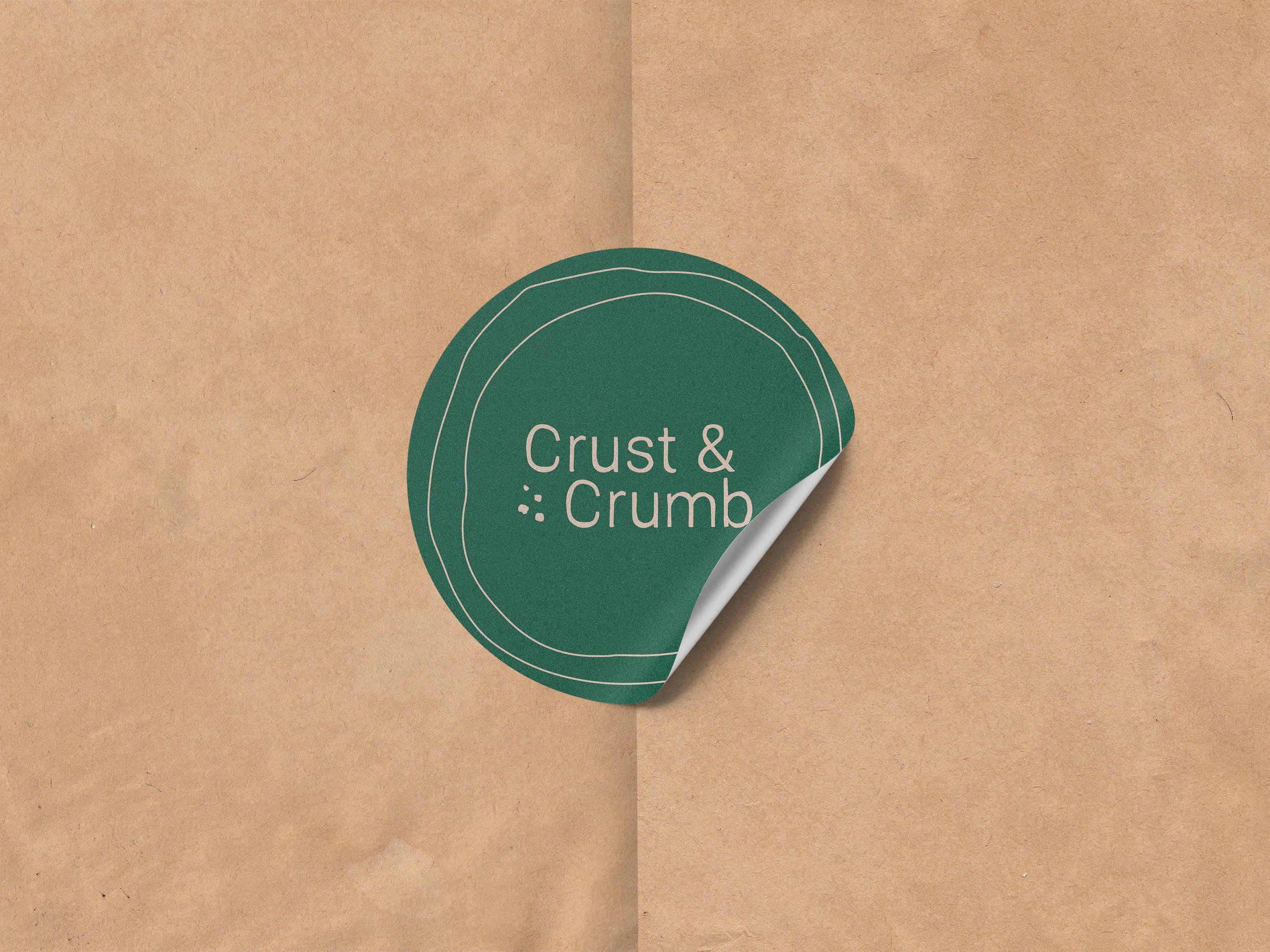
Logo – The signature bread icon was drawn in a rustic and jagged style to communicate that bread comes in all shapes and sizes, this is not a place for pretentiousness. The typeface matches this energy with an understated and rustic style with some added crumbs adding contrast and detail. The key to charm in design is simplicity and subtle hints that we can all recognise and enjoy.
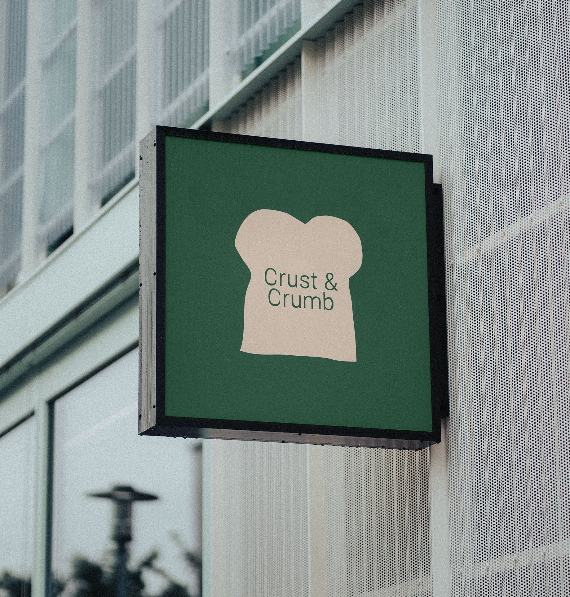
Icon – The bread slice illustration became a recognisable trope for the brand, providing audience recognition across various touch-points whether used in large or small applications.
Colours – The colours were a chance to set ourselves further apart from other high street sandwich shops and cafes. A very light brown shade was chosen to represent our rustic bread coloured typography and was supplemented by a rich green and brown. I wanted the colours to feel as though you were sat in a living room with a homely green sofa and a complimentary orange adding the warmth of a fireplace.
Implementation
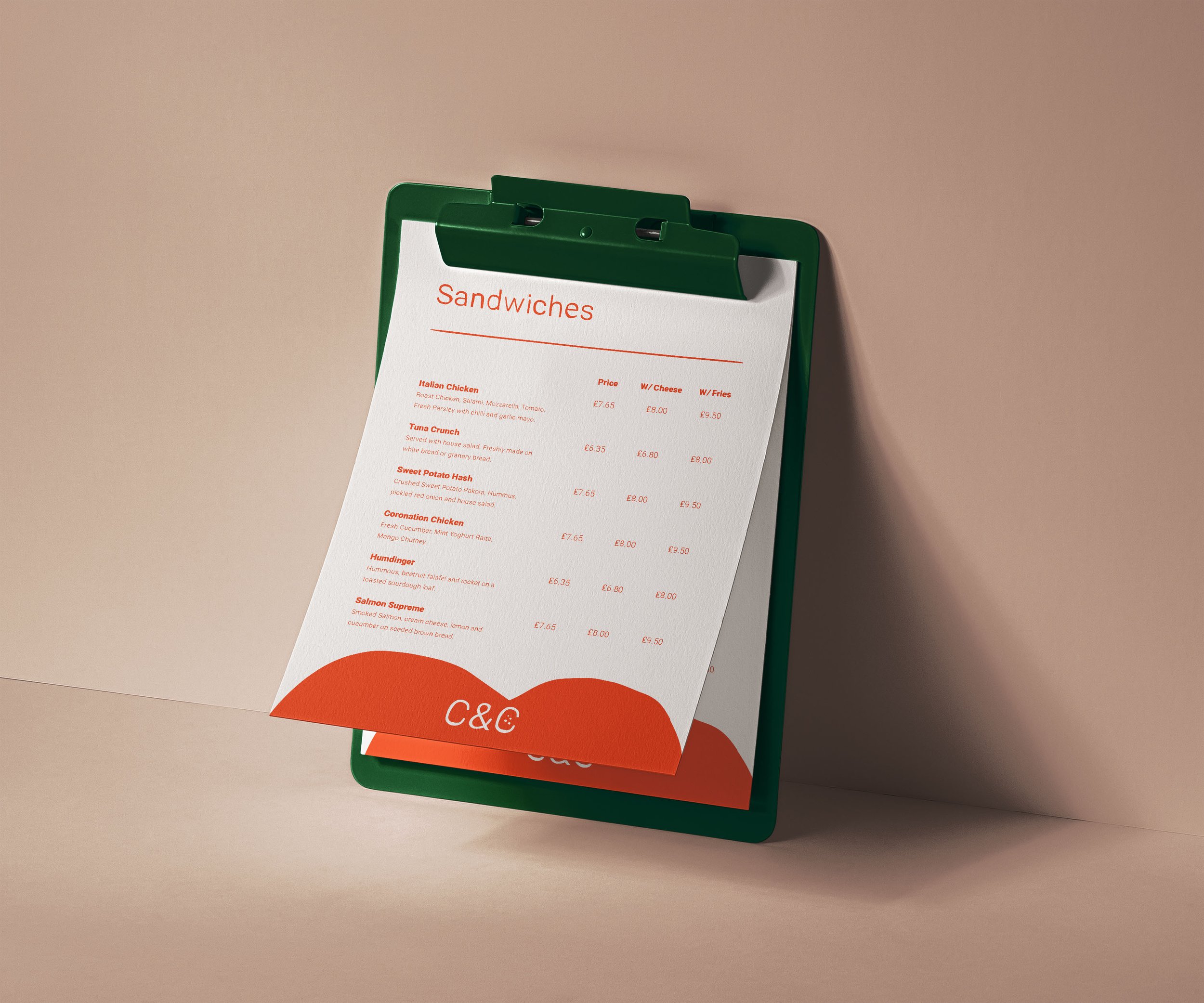
Because of the visual identity’s strategic and thought-through logic the implementation was equally simple. For digital applications it was essential for extra textures to be added to make sure the block colours didn’t look too shiny and clean. I also used the brand’s signature bread slice as a texturing tool, blown up to a large size and layered over backgrounds for extra contrast and patterning in the design of marketing materials.


Results
The visual elements successfully communicated the coziness, approachability, and homeliness of the cafe. Crust & Crumb emerged as a distinct and memorable brand, capturing the attention and loyalty of its locale. The colours demand attention before the minimal typography and iconography charms its audience.
Conclusion
Through strategic design choices, Crust & Crumb achieved its goal of embodying the spirit of a humble, independent sandwich shop and a warm and appealing place to get a sandwich and a coffee. The visual identity successfully conveyed the simplicity and comfort associated with bread, making it a the physical embodiment of man’s real best friend, and who could resist stopping by there?